vue.jsとFirebaseでSlackクローン構築(Tailwind CSS編パート2)
vue.jsとFirebaseのRealtime DatabaseとAuthorization機能を利用したSlackクローンの構築を複数回にわけて行っています。前回の文書ではFirebaseの認証機能を使ってサインイン、サインアウトの機能を実装しました。4回目となる今回はSlack Cloneでメッセージの送受信を行うメインページの画面をTailwind CSSを利用して作成していきます。
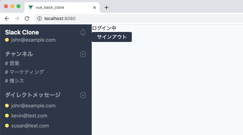
最終的には下記のメッセージ画面を作成します。静的な画面なのでこの文書を読み終えてもメッセージの送受信などを行うことはできません。次回の文書で送受信機能を実装する予定です。
目次
メインページ画面の作成
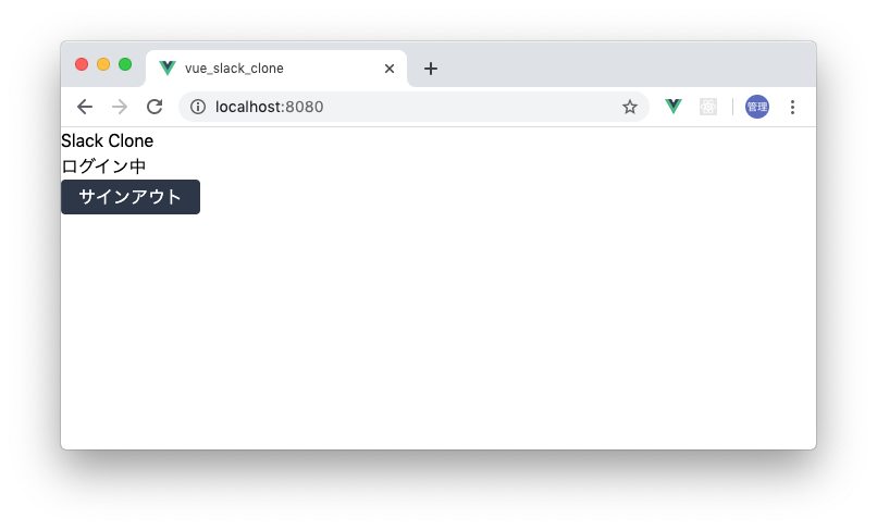
ユーザの登録画面とサインインの画面の作成は完了しましたがメッセージの送受信を行うメイン画面の作成は完了していません。前回ではメイン画面用のHome.vueファイルにSlack Cloneとサインアウトのボタンを追加したところで完了しています。
カラムの作成
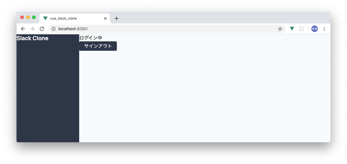
Home.vueファイルに2つのカラムを作成します。1つはチャネルやユーザの一覧を表示し、もう1つのカラムにはSlack Clone上でやりとりするメッセージとメッセージ入力フォームを表示します。本書では前者はサイドバー、後者はメインと呼んで説明を進めていきます。
サイドバー、メインともにわかりやすくするために最初は背景色をつけておきます。Flexboxを利用してサイドバーの幅は全体の1/5(w-1/5)とし残りの領域をメインの幅(flex-growを設定)としています。
<template>
<div class="flex h-screen">
<div class="w-1/5 bg-gray-800 text-white">
<h1 class="font-semibold text-xl leading-tight">Slack Clone</h1>
</div>
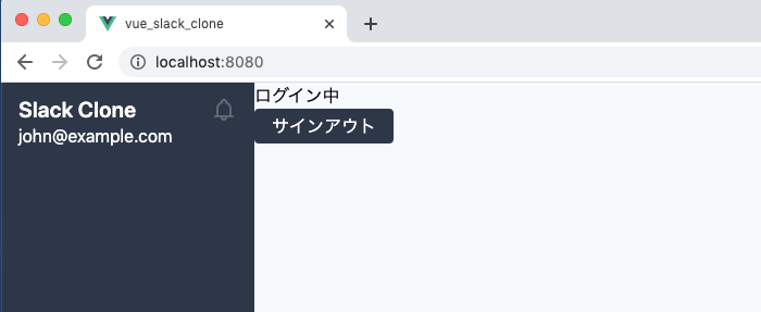
<div class="flex-grow bg-gray-100">
<p>ログイン中</p>
<div>
<button class="py-1 px-4 bg-gray-800 text-white rounded">サインアウト</button>
</div>
</div>
</div>
</template>
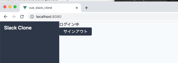
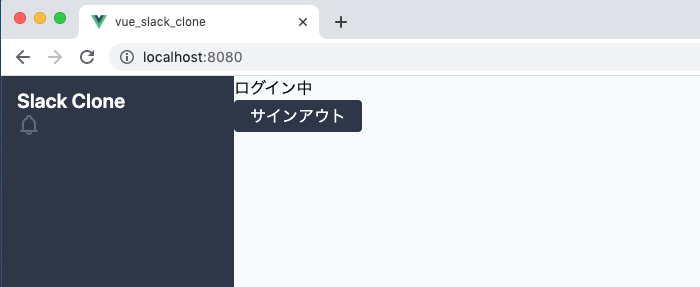
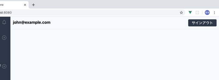
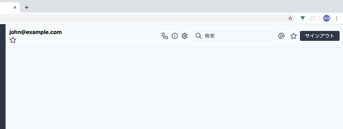
ブラウザで確認すると下記のように表示されます。

サイドバーの作成
サイドバーから作成していきます。サイドバーにはユーザ情報、チャンネル情報、ユーザ一覧を表示します。
Slack Cloneのロゴの文字にスペースを与えるためpaddingの設定を行います。
<div class="w-1/5 bg-gray-800 text-white pt-3 px-4">
  <h1 class="font-semibold text-xl leading-tight">Slack Clone</h1>
</div>
アイコンの追加
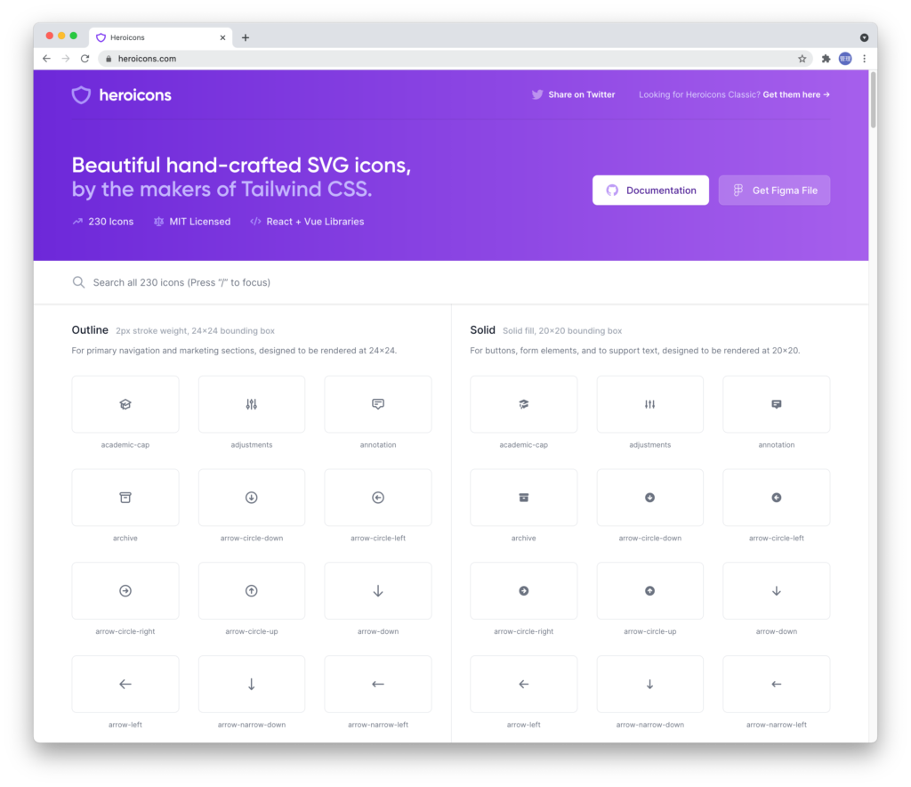
アイコンが必要な場合はTailwind CSSのドキュメントで紹介されているフリーのSVGを利用することができます。下記の画面はv1.9バージョンの時の画面です。現在はTailwind CSSのバージョンは2.Xになっているので画面が変わっています。
フルーのSVGがダウンロードできるURLが記載されているのはhttps://tailwindcss.com/resources#iconsです。左のメニューからResourceを選択し、Iconsからアクセスすることができます。
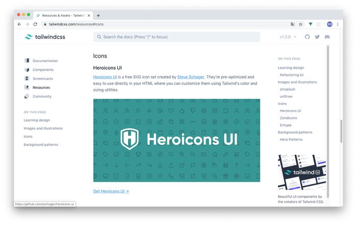
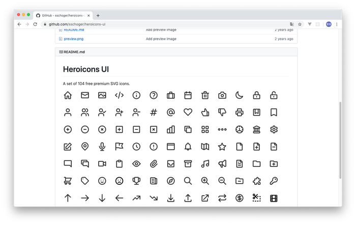
Heroicons UIのリンク先はGitHubのページになっているので使いたいアイコンがあればダウンロードして使用することができます。
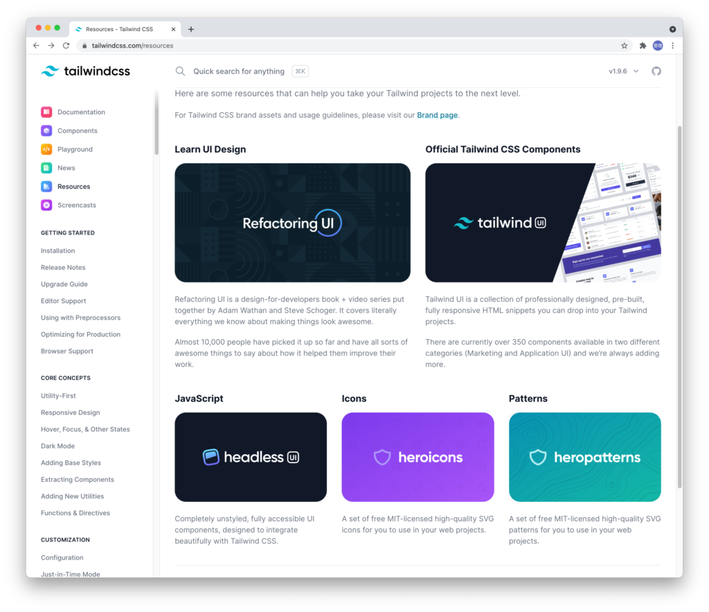
Tailwind CSSのバージョン2.Xの場合は下記になっています。heroiconsのバナーをクリックしてください。
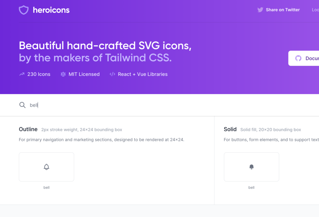
アイコンを探したい時は検索することができます。
最初に必要なのはベルのアイコンなのでicon-notification.svgファイルを利用します。
icon-notification.svgファイルを開いてそのまま中身を貼り付けるとアイコンが画面に表示されます。
<h1 class="font-semibold text-xl leading-tight">Slack Clone</h1>
<svg xmlns="http://www.w3.org/2000/svg" viewBox="0 0 24 24" width="24" height="24">
  <path
    class="heroicon-ui"
    d="M15 19a3 3 0 0 1-6 0H4a1 1 0 0 1 0-2h1v-6a7 7 0 0 1 4.02-6.34 3 3 0 0 1 5.96 0A7 7 0 0 1 19 11v6h1a1 1 0 0 1 0 2h-5zm-4 0a1 1 0 0 0 2 0h-2zm0-12.9A5 5 0 0 0 7 11v6h10v-6a5 5 0 0 0-4-4.9V5a1 1 0 0 0-2 0v1.1z"
  />
</svg>
heroiconsのページではNotificationではなくbellで検索してください。
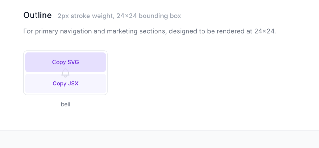
アイコンの上にマウスを乗せるとCopy SVGが表示されるのでクリックしてください。コピーしてそのままペーストしてください。
Slack Cloneの文字列の下にNotification(Bell)のアイコンが表示されています。
アイコンSVGのコンポーネント化
そのままsvgタグを貼り付けても表示できるのですがsvgファイルのテキストの中身が長いのでコードが読みづらくなうのでsvgタグをコンポーネント化します。またコンポーネント化すると再利用することもできます。
componentsディレクトリにiconsディレクトリを作成しNotification.vueファイルを作成します。Notification.svgファイルの中身をペーストしてclassを設定します。
<template>
  <svg
    xmlns="http://www.w3.org/2000/svg"
    viewBox="0 0 24 24"
    class="h-6 w-6 fill-current text-white opacity-25"
  >
    <path
      class="heroicon-ui"
      d="M15 19a3 3 0 0 1-6 0H4a1 1 0 0 1 0-2h1v-6a7 7 0 0 1 4.02-6.34 3 3 0 0 1 5.96 0A7 7 0 0 1 19 11v6h1a1 1 0 0 1 0 2h-5zm-4 0a1 1 0 0 0 2 0h-2zm0-12.9A5 5 0 0 0 7 11v6h10v-6a5 5 0 0 0-4-4.9V5a1 1 0 0 0-2 0v1.1z"
    />
  </svg>
</template>
作成したコンポーネントをHome.vueファイルで利用するためにimportを行います。
import firebase from "firebase/app";
import "firebase/auth";

import Notification from "../components/icons/Notification";

export default {
  components: {
    Notification
  },
// 略
先程まで直接記述していたsvgタグをコンポーネントのNotificationに変更します。
<div class="w-1/5 bg-gray-800 text-white pt-3 px-4">
  <h1 class="font-semibold text-xl leading-tight">Slack Clone</h1>
  <Notification />
</div>
今後アイコンを設定する場合は同じ方法でコンポーネントを作成します。
アイコンの配置場所の調節
Flexboxを利用してSlack Cloneの右側にNotificationのアイコンを配置します。
<div class="w-1/5 bg-gray-800 text-white pt-3 px-4">
  <div class="flex justify-between items-center">
    <h1 class="font-semibold text-xl leading-tight">Slack Clone</h1>
    <Notification />
  </div>
</div>

ユーザ情報の取得
/(ルート)へアクセスできるのはサインインしているユーザだけなのでライフサイクルフックのmountedを利用してFirebaseからユーザ情報を取得します。
ユーザの認証時にFirebaseのonAuthStateChangedメソッドを利用してユーザ情報を取得しましたがここではfirebase.auth().currentUserを使用してユーザ情報を取得します。どちらでのユーザ情報を取得することができます。
vue.jsのデータプロパティにuserを追加し、mountedでfirebase.auth().currenetUserを実行し、追加したuserに取得したユーザ情報を設定します。
export default {
  components: {
    Notification
  },
  data() {
    return {
      user: ""
    };
  },
  methods: {
    signOut() {
      firebase.auth().signOut();
      this.$router.push("/signin");
    }
  },
  mounted(){
    this.user = firebase.auth().currentUser;
  }
};
ユーザ情報の表示
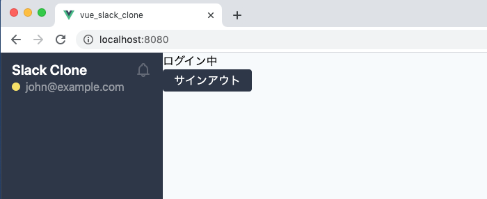
取得したユーザ情報を表示します。FirebaseにはEmailしか登録していないのでユーザ名ではなくEmailを使います。
<div class="w-1/5 bg-gray-800 text-white pt-3 px-4">
  <div class="flex justify-between items-center">
    <h1 class="font-semibold text-xl leading-tight">Slack Clone</h1>
    <Notification />
  </div>
  <div>{{ user.email }}</div>
</div>
Firebaseから取得したユーザ情報を利用してemailが表示されることが確認できます。
Emailの左側に○を表示させ文字のカラーをopacityで調整します。
<div class="flex items-center">
  <span class="bg-yellow-400 rounded-full w-3 h-3 mr-2"></span>
  <span class="opacity-50">{{ user.email }}</span>
</div>
ブラウザで確認すると以下のように表示されます。
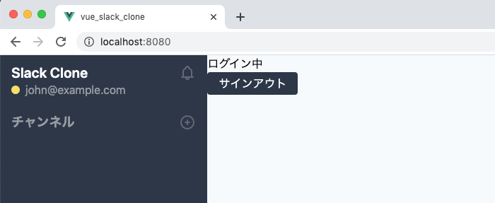
チャンネルの追加
チャンネルの機能はまだ実装されていないためダミーでチャンネル情報の表示を行います。
チャンネルの表示には文字列とアイコンを使用します。アイコンはHeroicons UIのicons-plus-circle.svgを使います。アイコンはPlusCircle.vueという名前でcomponents¥iconsの下にコンポーネントファイルを作成します。
<template>
<svg
  xmlns="http://www.w3.org/2000/svg"
  viewBox="0 0 24 24"
  stroke="currentColor"
  class="h-6 w-6 text-white opacity-25">
  <path stroke-linecap="round" stroke-linejoin="round" stroke-width="2" d="M12 9v3m0 0v3m0-3h3m-3 0H9m12 0a9 9 0 11-18 0 9 9 0 0118 0z" />
</svg>
</template>
チャンネルとアイコンのHTMLタグをユーザ情報の下に追加します。
<div class="mt-5 flex justify-between items-center">
  <div class="font-bold opacity-50 text-lg">チャンネル</div>
  <PlusCircle />
</div>
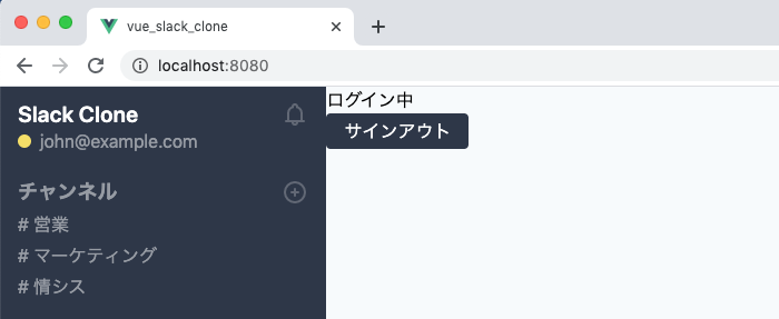
ダミーでチャンネルを追加します。
コンポーネントファイルを作成したらimportは忘れずに行う必要があります。
import firebase from 'firebase/app';
import 'firebase/auth';
import Notification from '../components/icons/Notification';
import PlusCircle from '../components/icons/PlusCircle';//追加
vue.jsのデータプロパティにchannelsを追加し、3つのチャンネル名を登録します。
  data() {
    return {
      user: "",
      channels: [
        {
          id: 1,
          channel_name: "営業"
        },
        {
          id: 2,
          channel_name: "マーケティング"
        },
        {
          id: 3,
          channel_name: "情シス"
        }
      ]
    };
  },
追加したchannelsはチャンネルの下でv-forを使って展開します。
<div
  class="opacity-50 mt-1"
  v-for="channel in channels"
  :key="channel.id"
># {{ channel.channel_name }}</div>
チャンネルの下にデータプロパティchannelsで登録した3件のチャンネル名が表示されます。
ダイレクトメッセージの設定
チャンネルと同じ方法でダイレクトメッセージの表示設定を行います。
先にダミーでデータプロパティにusersを追加します。
  data() {
    return {
      user: "",
      users: [
        {
          user_id: 11,
          email: "john@example.com"
        },
        {
          user_id: 12,
          email: "kevin@test.com"
        },
        {
          user_id: 13,
          email: "susan@test.com"
        }
      ],
      channels: [
チャンネルの下にユーザの情報を追加します。
<div class="mt-5 flex justify-between items-center">
  <div class="font-bold opacity-50 text-lg">ダイレクトメッセージ</div>
  <PlusCircle />
</div>
<div class="mt-2 flex items-center" v-for="user in users" :key="user.user_id">
  <span class="bg-yellow-400 rounded-full w-3 h-3 mr-2"></span>
  <span class="opacity-50">{{ user.email }}</span>
</div>
ブラウザで確認するとチャンネルの下にダイレクトメッセージとユーザの一覧が表示されることが確認できます。
ここまででサイドバーの作成は終了です。
メインの作成
メッセージの内容を表示させるメインの作成を行っていきます。
ヘッダーの設定
メインの上部のヘッダーの左上には最終的にはメッセージの送信相手の情報(チェンネル名やユーザ名)を表示させますがメッセージ送信機能はまだ実行されていないのでログインしたユーザのemailを表示させ、右側にはログアウトボタンを表示させます。
<div class="flex-grow bg-gray-100">
  <header class="border-b">
    <div class="flex justify-between m-3">
      <div class="font-bold text-lg">{{ user.email}}</div>
      <div>
        <button class="py-1 px-4 bg-gray-800 text-white rounded" @click="signOut">サインアウト</button>
      </div>
    </div>
  </header>
</div>
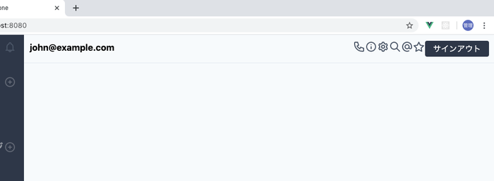
左側にemail、右側にログアウトボタンが表示されます。
アイコンの追加
ヘッダーにいくつかアイコンを追加しますがこれまでと同様にアイコンはHeroicons UIを利用してコンポーネントを作成します。
icon-search.svg, icon-star.svg, icon-cog.svg, icon-call.svg, icon-information.svg, atsymbol.svgを使います。
対応するコンポーネントはcomponets¥iconsの下にSearch.vue, Star.vue, Cog.vue, Call.vue, Information.vue, AtSymbol.vueという名前で保存します。
Search.vueのように今回追加したアイコンにはtailwindのclass text-gray-700でカラーを設定しています。
<template>
  <svg
    xmlns="http://www.w3.org/2000/svg"
    viewBox="0 0 24 24"
    class="h-6 w-6 fill-current text-gray-700"
  >
    <path
      class="heroicon-ui"
      d="M16.32 14.9l5.39 5.4a1 1 0 0 1-1.42 1.4l-5.38-5.38a8 8 0 1 1 1.41-1.41zM10 16a6 6 0 1 0 0-12 6 6 0 0 0 0 12z"
    />
  </svg>
</template>
Home.vueファイルで追加したアイコンのコンポーネントをimportします。
import Notification from "../components/icons/Notification";
import PlusCircle from "../components/icons/PlusCircle";
import Search from "../components/icons/Search";
import Star from "../components/icons/Star";
import Cog from "../components/icons/Cog";
import Call from "../components/icons/Call";
import Information from "../components/icons/Information";
import AtSymbol from "../components/icons/AtSymbol";

export default {
  components: {
    Notification,
    PlusCircle,
    Search,
    Star,
    Cog,
    Call,
    Information,
    AtSymbol
  },
  data() {
追加したアイコンコンポーネントをヘッダーに追加します。
<div class="flex justify-between m-3">
  <div class="font-bold text-lg">{{ user.email}}</div>
  <div class="flex">
    <Call />
    <Information />
    <Cog />
    <Search />
    <AtSymbol />
    <Star />
    <button class="py-1 px-4 bg-gray-800 text-white rounded" @click="singOut">サインアウト</button>
  </div>
</div>
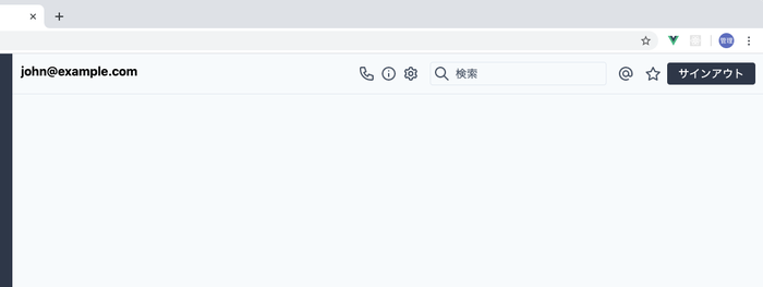
ダミーの検索枠とアイコンの調整を行います。
<div class="flex justify-between m-3">
  <div class="font-bold text-lg">{{ user.email}}</div>
  <div class="flex items-center">
    <Call class="mx-2" />
    <Information />
    <Cog class="mx-2" />
    <div class="border w-64 rounded p-1 ml-2 mr-2 flex">
      <Search />
      <span class="ml-2 text-gray-700">検索</span>
    </div>
    <AtSymbol class="mx-2" />
    <Star class="mx-2" />
    <button class="py-1 px-4 bg-gray-800 text-white rounded" @click="signOut">サインアウト</button>
  </div>
</div>
emailの下にも☆のアイコンを追加しておきます。
<div>
  <div class="font-bold text-lg">{{ user.email}}</div>
  <Star />
</div>
メッセージ表示、入力部分の作成
メッセージを表示させる部分とメッセージを入力する部分を作成します。
Flexboxのflex-colとflex-grow利用して入力する部分がブラウザの一番下になるように設定します。
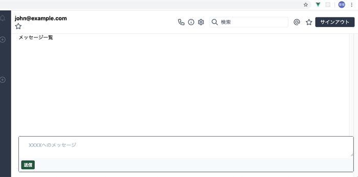
flex-growはメッセージを表示するdivに設定し、メッセージを入力する部分以外の残りの領域をflex-growを設定したdivが占めるように設定を行っています。またメッセージが増えた場合にスクロールバーで移動できるようにoverflow:yを設定しています。
<div class="flex flex-col flex-grow bg-gray-100">
<header class="border-b">
//略
</header>
<main class="overflow-y-scroll flex-grow">
  <div class="flex flex-col ml-6 h-full">
    <div class="flex-grow overflow-y-scroll">
      <p>メッセージ一覧</p>
    </div>
    <div class="border border-gray-900 rounded mb-4">
      <textarea class="w-full pt-4 pl-8 outline-none" placeholder="XXXXへのメッセージ"></textarea>
      <div class="bg-gray-100 p-2">
        <button class="bg-green-900 text-sm text-white font-bold py-1 px-2 rounded">送信</button>
      </div>
    </div>
  </div>
</main>
アバター画像の設定
メッセージの表示を設定する前にユーザのアバター画像の設定を行います。通常だとユーザ毎に各自が画像を用意して設定を行いますが本アプリケーションではhttps://pravatar.cc/の画像を利用します。
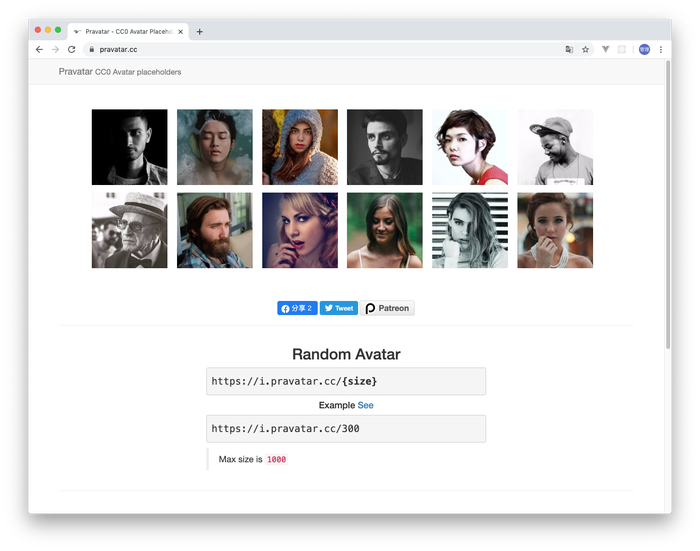
https://i.pravator.cc/50でアクセスすると50サイズの画像がランダムで表示されます。画像を固定したい場合は、https://i.pravator.cc/50?u=john@example.comと設定すると毎回同じ画像を取得することができます。
componetsディレクトリの中にAvator.vueファイルを作成します。propsを利用してコンポーネント外部から情報を受け取ります。受け取った情報を使ってpravator.ccから画像を取得しています。
<template>
  <div>
    <img :src="avator_url" class="rounded" />
  </div>
</template>

<script>
export default {
  name: "Avator",
  props: ["user"],
  computed: {
    avator_url() {
      return "https://i.pravatar.cc/50?u=" + this.user;
    }
  }
};
</script>
メッセージを表示する際に作成したAvatorコンポーネントを利用します。Home.vueファイルへのAvatorコンポーネントのimportを行っておきます。
import Information from "../components/icons/Information";
import AtSymbol from "../components/icons/AtSymbol";
import Avator from "../components/Avator";

export default {
  components: {
    Notification,
    PlusCircle,
    Search,
    Star,
    Cog,
    Call,
    Information,
    AtSymbol,
    Avator
  },
メッセージの表示
ダミーメッセージを使ってメッセージ表示部分の作成を行います。Avatorコンポーネントのpropsにはemailを渡しています。emailはユーザ毎に一意で固定されているのでemailが同じであればいつも同じ画像が取得されることになります。
<div class="flex-grow overflow-y-scroll">
  <div class="mt-2 mb-4 flex">
    <Avator :user="user.email" />
    <div class="ml-2">
      <div class="font-bold">{{ user.email }}</div>
      <div>初めてのメッセージ</div>
    </div>
  </div>
</div>
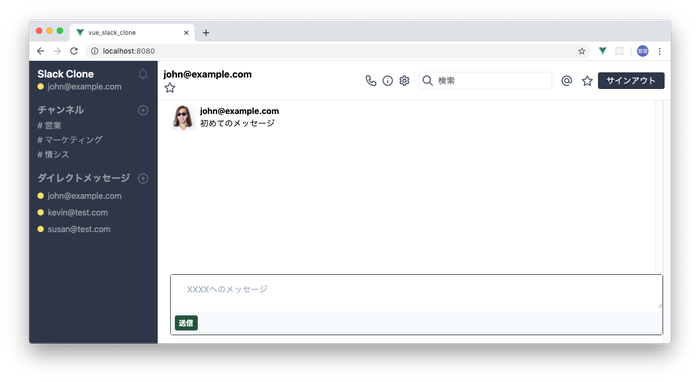
ブラウザで確認すると以下のような画面が表示されます。
tailwindcssを利用することでSlackクローンのサインイン後の画面を作成することができました。
サインイン後の画面では、Vue.jsとFirebaseを使ってサインインしたユーザ情報のみを利用していましたが、次回はユーザ同士でのメッセージの送受信を実装していきます。