爆発的人気のshadcn/uiライブラリを使いこなすための基礎

本文書はshadcn/uiの初心者向けガイドで初めてshadcn/uiを利用したい人向けの入門的な内容になっています。shadcn/uiの特徴は一般的なUIライブラリのように再利用可能なコンポーネントを一括でインストールして利用していくのではなく利用したいコンポーネントのみ個別にインストールすることができます。さらにインストールしたコンポーネントは各自の環境に合わせてカスタマイズすることを前提にしているためコンポーネントのインストールしなくてもコードをコピー&ペーストすることで手軽に導入できるため、プロジェクトの自由度が高まります。
インストールして利用できるコンポーネントの中から Button, DropDownMenu, Form, Table の 4 つのコンポーネントに注目して shadcn/ui の使い方を確認しています。Next.jsの環境で動作確認を行っていますがReact用のコンポーネントライブラリなのでNext.jsに関する知識がなくても利用できます。

目次
shadcn/ui とは
shadcn/uiはReactのUI コンポーネントライブラリであるRadix UIとCSSフレームワークのTailwind CSS を利用して作成した再利用可能なコンポーネントを提供してくれるライブラリです。
shadcn/uiがどのようなライブラリなのかを表す一文がドキュメントのIntroductionに記載されています。“Pick the components you need. Copy and paste the code into your project and customize to your needs. The code is yours.”の意味を理解することができれば shadcn/ui と一般的な UI コンポーネントライブラリとの違いが理解できます。上記の意味はこれから行うButtonコンポーネントの説明を読むだけですぐに理解することができます。
Radix UI(後ほど説明しますが、機能だけを提供するUIライブラリ)に対してスタイルを適用したい場合はshadcn/uiを利用する必要はありません。ではどのような場合に shadcn/ui を利用するのかというと以下のような場面での利用が考えられます。
- shadcn/uiのデザインがシンプルでかっこいいので利用したい
- Radix UIを利用したいがデザインは自分で行いたくない
- shadcn/uiを利用して基本的なスタイリングが完了したコンポーネントをカスタマイズしてオリジナルデザインのコンポーネントを作成したい
shadcn/uiは便利で人気がある反面、利用者が増えれば増えるほど似たようなデザインのサイトが増えているという欠点もあります。そのためshadcn/uiをうまく利用しながらオリジナルデザインを作成するためにshadcn/uiのカスタマイズ方法を理解しておく必要があります。
React以外にもVue.js用のshadcn-vue, Svelte用のshadcn-svelteなどもありますがそれらはshadcnのOfficialなライブラリではありませんがshadcn/uiと同様の方法で利用することができます。他のフレームワーク用で作成されることからも人気の高さを窺わせます。
shadcn/uiはだれが利用しているの?
shadcn/uiはどのような人が利用しているのか気になる人もいるかと思います。WebページやアプリケーションのUIデザインだけではなくプレゼン資料のスライドにも利用できると話題のVercelのv0でもユーザーが入力したテキストプロンプトや画像に基づいてshadcn/uiとTailwind CSSを基盤としたReactコードを生成します。
Radix UI(Primitives) とは
Radix UI(Primitives)はスタイルが適用されておらず(UnStyled)、機能のみ提供しているコンポーネントライブラリでHeadless UIライブラリと呼ばれます。ドロップダウンメニューやダイアログをアプリケーションに実装したい場合にすべて一から自作するのは大変だがライブラリの力を借りてライブラリの制限を受けないオリジナルデザインで作成したいという場合に利用される UI ライブラリです。


Tailwind CSSとは
Tailwind CSSはfont-bold(文字を太線に), text-center(文字列を中央揃え)などのutility classを備えた CSS フレームワークです。Radix Primitivesではスタイルが適用されていないコンポーネントのみを提供しているので shadcn/uiではRadixが提供するコンポーネントに対してTailwind CSSのutility classでスタイルを適用しています。Tailwind CSS を利用しているのでデザインを変更したい場合は簡単にカスタマイズすることができます。

環境の構築
ドキュメントに記載されているNext.js での shadcn のインストールの方法を確認しながら環境の構築を行なっていきます。
Next.js のプロジェクトの作成を行うために”npx create-next-app”コマンドを実行します。コマンドを実行するといくつか質問が行われますがすべてデフォルトを選択してインストールを行います。プロジェクト名には任意の名前をつけることができますがここでは shadcn-nextjs としています。
 % npx create-next-app@latest shadcn-nextjs --typescript --tailwind --eslint
✔ Would you like to use `src/` directory? … No / Yes
✔ Would you like to use App Router? (recommended) … No / Yes
✔ Would you like to customize the default import alias? … No / Yes
Creating a new Next.js app in /Users/mac/Desktop/shadcn-nextjs.

Using npm.

Initializing project with template: app-tw


Installing dependencies:
- react
- react-dom
- next
- typescript
- @types/react
- @types/node
- @types/react-dom
- tailwindcss
- postcss
- autoprefixer
- eslint
- eslint-config-next

added 327 packages, and audited 328 packages in 25s

117 packages are looking for funding
  run `npm fund` for details

found 0 vulnerabilities
Initialized a git repository.

Success! Created shadcn-nextjs at /Users/mac/Desktop/shadcn-nextj
プロジェクトの作成が完了したら、プロジェクトディレクトリに移動します。
% cd shadcn-nextjs
shadcn の設定を行うために”npx shadcn-ui@latest init”コマンドを実行します。コマンドを実行後にプロジェクトフォルダ直下に components.json ファイルが作成されます。
新しいバージョン
% npx shadcn-ui@latest init

Need to install the following packages:
shadcn-ui@0.8.0
Ok to proceed? (y) y
✔ Which style would you like to use? › Default
✔ Which color would you like to use as base color? › Slate
✔ Would you like to use CSS variables for colors? … no / yes

✔ Writing components.json...
✔ Initializing project...
✔ Installing dependencies...

Success! Project initialization completed. You may now add components.
components.json ファイルの内容は下記のようになっています。
{
  "$schema": "https://ui.shadcn.com/schema.json",
  "style": "default",
  "rsc": true,
  "tsx": true,
  "tailwind": {
    "config": "tailwind.config.ts",
    "css": "app/globals.css",
    "baseColor": "slate",
    "cssVariables": true,
    "prefix": ""
  },
  "aliases": {
    "components": "@/components",
    "utils": "@/lib/utils"
  }
}
古いバージョン
古いバージョンではインストール時の質問がかなりありましたがバージョンがアップしてインストール時に聞かれる質問の数が減少しています。
% npx shadcn-ui@latest init
✔ Would you like to use TypeScript (recommended)? … no / yes
✔ Which style would you like to use? › Default
✔ Which color would you like to use as base color? › Slate
✔ Where is your global CSS file? … src/app/globals.css
✔ Would you like to use CSS variables for colors? … no / yes
✔ Where is your tailwind.config.js located? … tailwind.config.js
✔ Configure the import alias for components: … @/components
✔ Configure the import alias for utils: … @/lib/utils
✔ Are you using React Server Components? … no / yes
✔ Write configuration to components.json. Proceed? … yes

✔ Writing components.json...
✔ Initializing project...
✔ Installing dependencies...

Success! Project initialization completed.
components.json ファイルの内容は下記のようになっています。
{
  "$schema": "https://ui.shadcn.com/schema.json",
  "style": "default",
  "rsc": true,
  "tsx": true,
  "tailwind": {
    "config": "tailwind.config.js",
    "css": "app/globals.css",
    "baseColor": "slate",
    "cssVariables": true
  },
  "aliases": {
    "components": "@/components",
    "utils": "@/lib/utils"
  }
}
Button コンポーネントの利用方法
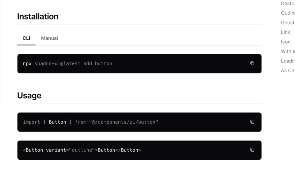
CLIによるインストール
shadcn を利用できる環境の構築ができたので動作確認のため Button コンポーネントの追加を行います。コンポーネント毎にコマンドを利用してインストールすることができます。
 % npx shadcn-ui@latest add button
✔ Ready to install components and dependencies. Proceed? … yes
✔ Done.
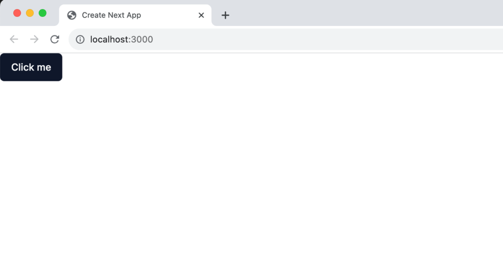
コマンド実行前は src/components ディレクトリ下には何も存在していませんでしたがコマンド実行後は ui ディレクトリの下に button.tsx ファイルが作成されます。作成された button.tsx ファイルを app ディレクトリの page.tsx ファイルで import して設定します。
import { Button } from '@/components/ui/button';
export default function Home() {
return (
<div>
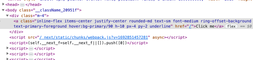
<Button>Click me</Button>
</div>
);
}
開発サーバを起動するために”npm run dev”コマンドを実行します。コマンドを実行すると Next.js のバージョンを確認することができます。
 % npm run dev

> shadcn-nextjs@0.1.0 dev
> next dev

  ▲ Next.js 13.5.4
  - Local:        http://localhost:3000

 ✓ Ready in 3.4s
ブラウザ上にはスタイルが適用されたボタンが表示されます。
インストール後に作成される components/ui/button.tsx ファイルを import するだけでスタイルが適用されたボタンを表示することができましたがどのような設定が行われているか button.tsx ファイルの中身を確認します。
import * as React from 'react';
import { Slot } from '@radix-ui/react-slot';
import { cva, type VariantProps } from 'class-variance-authority';

import { cn } from '@/lib/utils';

const buttonVariants = cva(
  'inline-flex items-center justify-center rounded-md text-sm font-medium ring-offset-background transition-colors focus-visible:outline-none focus-visible:ring-2 focus-visible:ring-ring focus-visible:ring-offset-2 disabled:pointer-events-none disabled:opacity-50',
  {
    variants: {
      variant: {
        default: 'bg-primary text-primary-foreground hover:bg-primary/90',
        destructive:
          'bg-destructive text-destructive-foreground hover:bg-destructive/90',
        outline:
          'border border-input bg-background hover:bg-accent hover:text-accent-foreground',
        secondary:
          'bg-secondary text-secondary-foreground hover:bg-secondary/80',
        ghost: 'hover:bg-accent hover:text-accent-foreground',
        link: 'text-primary underline-offset-4 hover:underline',
      },
      size: {
        default: 'h-10 px-4 py-2',
        sm: 'h-9 rounded-md px-3',
        lg: 'h-11 rounded-md px-8',
        icon: 'h-10 w-10',
      },
    },
    defaultVariants: {
      variant: 'default',
      size: 'default',
    },
  }
);

export interface ButtonProps
  extends React.ButtonHTMLAttributes<HTMLButtonElement>,
    VariantProps<typeof buttonVariants> {
  asChild?: boolean;
}

const Button = React.forwardRef<HTMLButtonElement, ButtonProps>(
  ({ className, variant, size, asChild = false, ...props }, ref) => {
    const Comp = asChild ? Slot : 'button';
    return (
      <Comp
        className={cn(buttonVariants({ variant, size, className }))}
        ref={ref}
        {...props}
      />
    );
  }
);
Button.displayName = 'Button';

export { Button, buttonVariants };
一見複雑なコードに見えるかもしれませんが button.tsx ファイルを眺めただけでも Button コンポーネントの variant, size props を利用することでボタンのスタイルを変更できることがわかるかと思います。
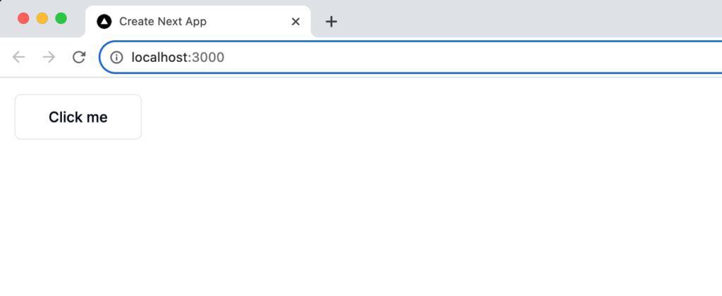
実際に Button コンポーネントの variant と size props に値を設定してみましょう。variant props には”outline”, size props には”lg”を設定しています。
import { Button } from '@/components/ui/button';

export default function Home() {
  return (
    <div className="m-4">
      <Button variant="outline" size="lg">
        Click me
      </Button>
    </div>
  );
}
先ほどのボタンとは異なり、ボタンがアウトラインのみで表示されボタンのサイズも大きくなっています。
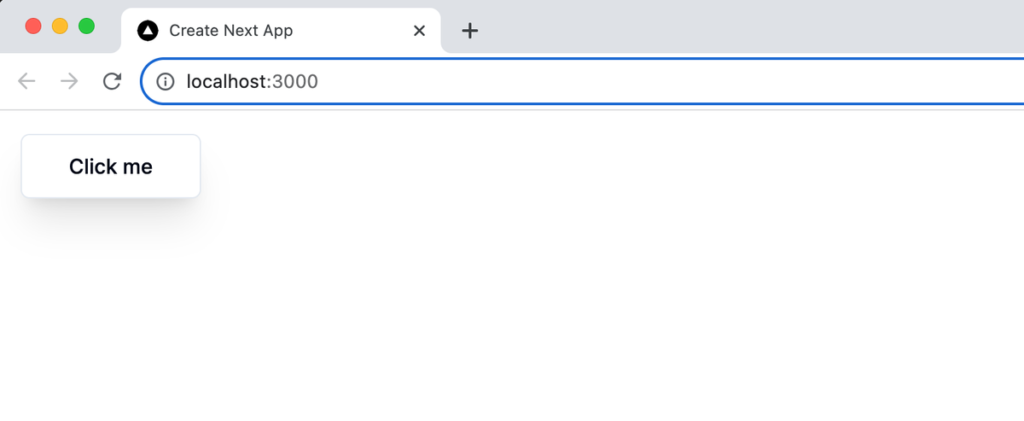
さらに className も反映されるようになっているので設定を行ってみます。
export default function Home() {
  return (
    <div className="m-4">
      <Button variant="outline" size="lg" className="shadow-xl">
        Click me
      </Button>
    </div>
  );
}
設定通り className の設定によりシャドウをつけることができました。
shadcn はコンポーネントライブラリではないので className, variant, size を設定するだけではなく button.tsx ファイルを自由に更新して利用するアプリケーションにあったコードに変更することが可能です。つまりもし必ずボタンにはシャドウをつけたいという場合は className で設定するのではなく直接 button.tsx ファイルを更新することができます。
const buttonVariants = cva(
  'shadow-xl inline-flex ...
  //略
また lg までしかない size に xl, 2xl といった値を設定することも可能です。
このように shadcn ではデフォルトの button.tsx ファイルを自由にカスタマイズすることができます。button.tsx ファイルのコピーして別名をつけることも別の場所に保存することもできます。
マニュアルによる設定
ドキュメントを確認すると各コンポーネントの Installation のでは”CLI”, “Manual”と 2 つのタブで構成されている。
CLI は Button コンポーネントを利用するために利用したコマンド”npx shadcn-ui@latest add button”ですが、マニュアルは”npm install @radix-ui/react-slot”で Radix UI の react-slot をインストールしてコードを貼り付けするだけと説明があります。
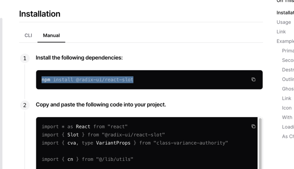
しかし実際に設定を行うとclass-variance-authorityや@lib/utilsファイルなど不足しているためエラーが発生します。実際に上記だけの手順でButtonコンポーネントを利用するためにはその他のパッケージが事前にインストールされている必要があります。
上記の方法も事前に”npm shadcn-ui@latest init”を実行しておくことが必要となるパッケージがインストーツされるので問題なくButtonコンポーネントを利用することができます。
ここまでの動作確認でドキュメントに記載されている”Pick the components you need. Copy and paste the code into your project and customize to your needs. The code is yours.”の理解ができたのではないしょうか。
shadcn をさらに理解するために
ボタンのスタイルを変更することができましたが button.tsx の中でいくつか気になる関数が import されています。importされている関数はコンポーネントをカスタマイズするためだけではなく、shadcn以外にも役に立つ関数なのでそれぞれを確認していきましょう。
import { Slot } from '@radix-ui/react-slot';
import { cva, type VariantProps } from 'class-variance-authority';
import { cn } from '@/lib/utils';
Slot
SlotはRadix Primitivesの@radix-ui/react-slotからimportされており、Radix PrimitivesのSlotのドキュメントには”Merges its props onto its immediate child.(その props を直近の子要素にマージする)“と説明があります。
直近の子要素に props をマージすることができるということなので試しに a 要素を Button コンポーネントでラップしてみます。
export default function Home() {
  return (
    <div className="m-4">
      <Button>
        <a href="/">Click me</a>
      </Button>
    </div>
  );
}
画面上にはボタンが表示され何も変化がありません。ブラウザのデベロッパーツールの要素を確認しても button 要素の内側に追加した a 要素が入っている状態です。
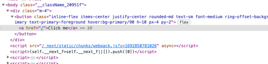
button.tsx ファイルを確認すると Slot は asChild の値が true の場合のみ利用されることがわかります。
const Button = React.forwardRef<HTMLButtonElement, ButtonProps>(
  ({ className, variant, size, asChild = false, ...props }, ref) => {
    const Comp = asChild ? Slot : 'button';
    return (
      <Comp
        className={cn(buttonVariants({ variant, size, className }))}
        ref={ref}
        {...props}
      />
    );
  }
);
Buttonコンポーネントに asChild props を追加します。propsで値を設定しない場合は true が設定されるためasChildの値はtrueとなります。
export default function Home() {
  return (
    <div className="m-4">
      <Button asChild>
        <a href="/">Click me</a>
      </Button>
    </div>
  );
}
ブラウザ上の見た目は変わりませんが、デベロッパーツールの要素を見ると先ほどとは異なり、button タグがなくなり、a タグに class が設定されていることがわかります。
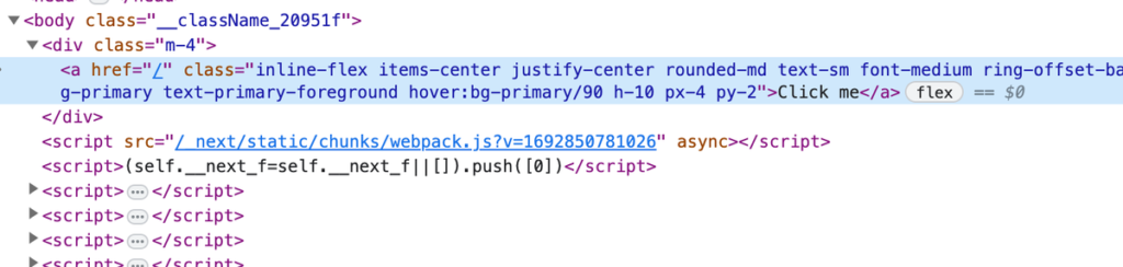
asChild props を設定することで button 要素ではなく子要素の a 要素として表示されることがわかりました。
props をマージしてくれるということなので下記のように Button コンポーネントに href 属性を設定、a 要素に className を設定します。
export default function Home() {
  return (
    <div className="m-4">
      <Button asChild href="/">
        <a className="underline">Click me</a>
      </Button>
    </div>
  );
}
設定したどちらの値も反映されることが確認できます。
cva(Class Variant Authority)
cva は Class Variant Authority の略で’class-variance-authority’ライブラリから import している関数です。Button コンポーネントの variant の値を”outline”, size の値を”lg”に設定するとボタンのデザインが変更になったのは cva の設定を行っているためです。
cva をどのように利用することができるかはclass-variance-authority のドキュメントの Variants のページで確認できます。
import { cva } from "class-variance-authority";

const button = cva('font-semibold', {
  variants: {
    intent: {
      primary: [
        "bg-blue-500",
        "text-white",
      ],
      // **or**
      // primary:"bg-blue500 text-white"
      secondary: [
        "bg-white",
        "text-gray-800",
      ],
    },
    size: {
      small: ["text-sm", "py-1", "px-2"],
      medium: ["text-base", "py-2", "px-4"],
    },
  },
  compoundVariants: [
    {
      intent: "primary",
      size: "medium",
      class: "uppercase",
    },
  ],
  defaultVariants: {
    intent: "primary",
    size: "medium",
  },
});

button();
// => "font-semibold bg-blue-500 text-white text-base py-2 px-4 uppercase"

button({ intent: "secondary", size: "small" });
// => "font-semibold bg-white text-gray-800 text-sm py-1 px-2"
cva 関数 の第一引数にはベースの class, 第二引数には options を設定することができます。options には variants, compoundVariants, defaultVariatns のオブジェクトを設定することができます。variants オブジェクトの中では選択できる値を定義します。上記では選択できる値として intent と size を定義しています。
cva から戻された値を持つ button の引数に variants で定義したプロパティを設定することができます。button の引数に何も指定しない場合は defaultVariants の値が利用されます。
※components/ui/button.tsx ファイルでは compoundVariants は利用していません。
さらに cva 関数から戻された値を利用して TypeScript の型情報を取得することができます。
import type { VariantProps } from "class-variance-authority";
//略
type ButtonProps = VariantProps<typeof button>
// type ButtonProps = {
//     intent?: "primary" | "secondary" | null | undefined;
//     size?: "small" | "medium" | null | undefined;
// }
cva の関数の利用方法が理解できたと思うので button.tsx ファイルの buttonVariants を再度確認します。buttonVariants の引数に variant, size が設定できることがわかります。何も指定しない場合には defaultValues の値が利用されます。
const buttonVariants = cva(
  'inline-flex items-center justify-center rounded-md text-sm font-medium ring-offset-background transition-colors focus-visible:outline-none focus-visible:ring-2 focus-visible:ring-ring focus-visible:ring-offset-2 disabled:pointer-events-none disabled:opacity-50',
  {
    variants: {
      variant: {
        default: 'bg-primary text-primary-foreground hover:bg-primary/90',
        destructive:
          'bg-destructive text-destructive-foreground hover:bg-destructive/90',
        outline:
          'border border-input bg-background hover:bg-accent hover:text-accent-foreground',
        secondary:
          'bg-secondary text-secondary-foreground hover:bg-secondary/80',
        ghost: 'hover:bg-accent hover:text-accent-foreground',
        link: 'text-primary underline-offset-4 hover:underline',
      },
      size: {
        default: 'h-10 px-4 py-2',
        sm: 'h-9 rounded-md px-3',
        lg: 'h-11 rounded-md px-8',
        icon: 'h-10 w-10',
      },
    },
    defaultVariants: {
      variant: 'default',
      size: 'default',
    },
  }
);
さらに components/ui/button.tsx の buttonVariants には variants で定義した variant, size の他に className も引数に設定しています。
buttonVariants({ variant, size, className })
className に設定された class の値は variant と size を指定して戻された buttonVariants に含まれる class に追加することができます。そのため先ほど確認したように className を Button コンポーネントに追加すると className に追加した class が反映されます。
export default function Home() {
  return (
    <div className="m-4">
      <Button variant="outline" size="lg" className="shadow-xl">
        Click me
      </Button>
    </div>
  );
}
cva を利用することで簡単に variant, size に独自の選択肢を追加することができスタイルの異なるボタンを増やすことができます。
cn
cn は’@/lib/utils’から import を行っているので utils ファイルの中身を確認します。utils ファイルでは twMerge と clsx 関数が利用されていることがわかります。
import { type ClassValue, clsx } from "clsx"
import { twMerge } from "tailwind-merge"

export function cn(...inputs: ClassValue[]) {
  return twMerge(clsx(inputs))
}
tailwind-merge
tailwind-merge は下記のように class がコンフリクトしている際に効率よくマージしてくれる関数です。
twMerge('px-2 py-1 bg-red hover:bg-dark-red', 'p-3 bg-[#B91C1C]')
// → 'hover:bg-dark-red p-3 bg-[#B91C1C]'
px-2, py-1 は padding の設定なので p-3 とコンフリクトしますが第二引数の p-3 で上書きしてくれます。bg-red と bg-[#B91C1C]も背景色の設定なのでコンフリクトしますが第二引数で設定した bg-[#B91C1C]で上書きされます。
第二引数がなく第一引数に記述した class がコンフリクトした場合は後に指定した class で上書きとなります。
twMerge('p-5 p-2 p-4') // → 'p-4'
clsx
clsx は下記のように引数に設定した文字列やオブジェクトを連結することができる関数です。
clsx('px-4 py-2', 'p-3', { 'bg-red-500': true });
//px-4 py-2 p-3 bg-gray-500
clsx だけではなコンフリクトした class を merge することはできないので tailwind-merge と一緒に利用することで以下のようにコンフリクトのない class にすることができます。
twMerge(clsx('px-4 py-2', 'p-3', { 'bg-red-500': true }));
//p-3 bg-gray-500
この処理が cn 関数として utils.tsx ファイルに記述されています。
import { type ClassValue, clsx } from "clsx"
import { twMerge } from "tailwind-merge"

export function cn(...inputs: ClassValue[]) {
  return twMerge(clsx(inputs))
}
ここまで読み進めればすべての設定を理解した上で button.tsx ファイルのカスタマイズが行えるはずです。
DropdownMenu の利用方法
Button コンポーネントは非常にシンプルなだったので複数のコンポーネントから構成されるドロップダウンメニューの設定を行うために dropdown-menu コンポーネントのインストールを行います。
% npx shadcn-ui@latest add dropdown-menu

✔ Ready to install components and dependencies. Proceed? … yes
✔ Done.
components/ui ディレクトリの下に dropdown-menu.tsx ファイルが作成されます。
dropdown-menu.tsx から import したコンポーネントを利用してドロップダウンメニューの設定を行います。
import {
  DropdownMenu,
  DropdownMenuContent,
  DropdownMenuItem,
  DropdownMenuLabel,
  DropdownMenuSeparator,
  DropdownMenuTrigger,
} from '@/components/ui/dropdown-menu';

export default function Home() {
  return (
    <div className="m-16">
      <DropdownMenu>
        <DropdownMenuTrigger>Open</DropdownMenuTrigger>
        <DropdownMenuContent>
          <DropdownMenuLabel>My Account</DropdownMenuLabel>
          <DropdownMenuSeparator />
          <DropdownMenuItem>Profile</DropdownMenuItem>
          <DropdownMenuItem>Billing</DropdownMenuItem>
          <DropdownMenuItem>Team</DropdownMenuItem>
          <DropdownMenuItem>Subscription</DropdownMenuItem>
        </DropdownMenuContent>
      </DropdownMenu>
    </div>
  );
}
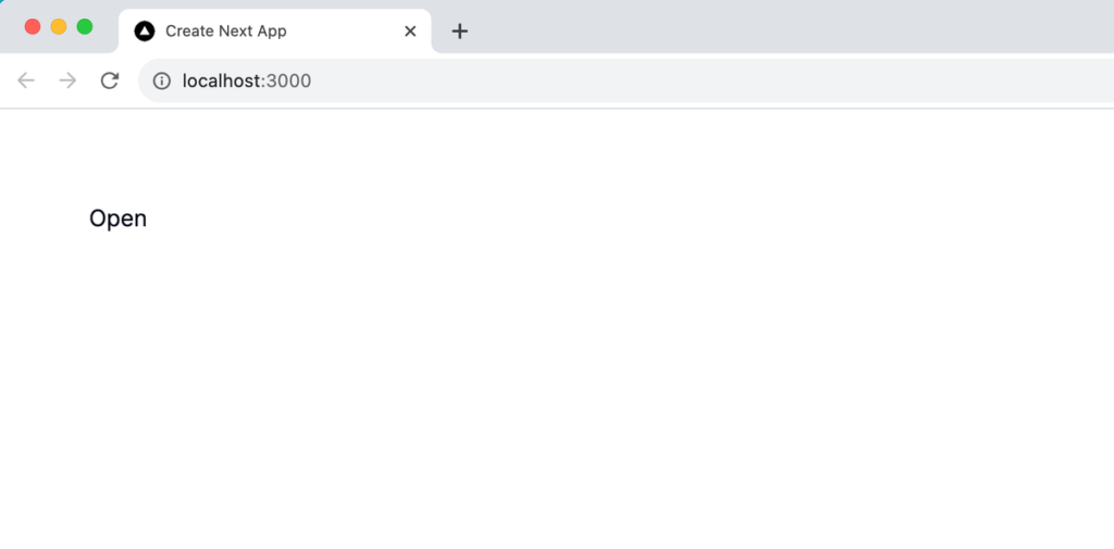
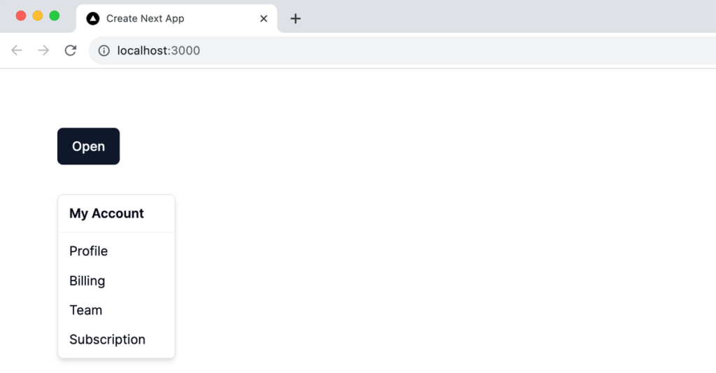
ブラウザで確認するとドロップダウンメニューが非表示の時は DropDownMenuTrigger タグの中に記述に Open の文字列が表示されます。
Open の文字列をクリックするとメニューが表示されます。
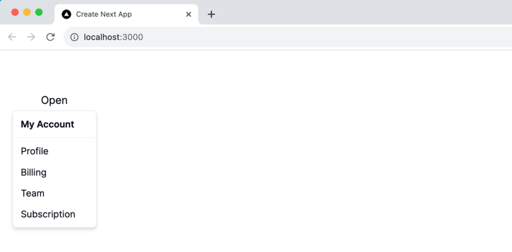
Open の文字列に何もスタイルが設定されていないところが気になるので dropdown-menu.tsx ファイルを確認します。
import * as React from "react"
import * as DropdownMenuPrimitive from "@radix-ui/react-dropdown-menu"
import { Check, ChevronRight, Circle } from "lucide-react"

import { cn } from "@/lib/utils"

const DropdownMenu = DropdownMenuPrimitive.Root

const DropdownMenuTrigger = DropdownMenuPrimitive.Trigger
//略
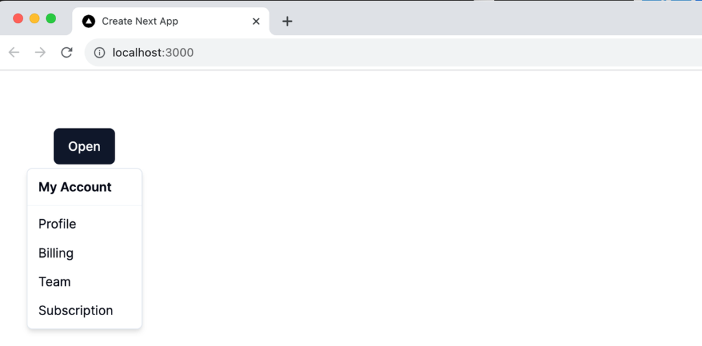
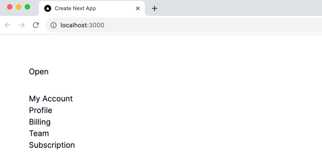
@radix-ui/react-dropdown-menu から import した DropdownMenuPrimitive.Trigger をそのまま利用していることがわかります。DropdownMenuPrimitive.Trigger はドロップダウンメニューを開閉する button 要素ですが Radix UI が提供するコンポーネントなのでスタイルは適用されていません。スタイルを適用したボタンとして表示されるためには shadcn の Button コンポーネントを利用します。
import { Button } from '@/components/ui/button';
import {
  DropdownMenu,
  DropdownMenuContent,
  DropdownMenuItem,
  DropdownMenuLabel,
  DropdownMenuSeparator,
  DropdownMenuTrigger,
} from '@/components/ui/dropdown-menu';

export default function Home() {
  return (
    <div className="m-16">
      <DropdownMenu>
        <DropdownMenuTrigger asChild>
          <Button>Open</Button>
        </DropdownMenuTrigger>
        //略
Open の文字列にスタイルが適用されます。
DropdownMenuTrigger 以外のタグではどのようなスタイルが設定されているか確認するために DropdownMenuContent を確認します。DropdownMenuContent はドロップダウンメニューが開いた時に表示されるコンテンツをラップする要素です。
ここでも cn 関数が利用されています。className を設定することで事前に設定されている class とマージすることができます。
const DropdownMenuContent = React.forwardRef<
  React.ElementRef<typeof DropdownMenuPrimitive.Content>,
  React.ComponentPropsWithoutRef<typeof DropdownMenuPrimitive.Content>
>(({ className, sideOffset = 4, ...props }, ref) => (
  <DropdownMenuPrimitive.Portal>
    <DropdownMenuPrimitive.Content
      ref={ref}
      sideOffset={sideOffset}
      className={cn(
        "z-50 min-w-[8rem] overflow-hidden rounded-md border bg-popover p-1 text-popover-foreground shadow-md data-[state=open]:animate-in data-[state=closed]:animate-out data-[state=closed]:fade-out-0 data-[state=open]:fade-in-0 data-[state=closed]:zoom-out-95 data-[state=open]:zoom-in-95 data-[side=bottom]:slide-in-from-top-2 data-[side=left]:slide-in-from-right-2 data-[side=right]:slide-in-from-left-2 data-[side=top]:slide-in-from-bottom-2",
        className
      )}
      {...props}
    />
  </DropdownMenuPrimitive.Portal>
))
sideOffset props で default 値が設定されています。 sideOffset の値では Trigger のボタンからの距離を設定することができます。他にも radix-ui のドキュメントを確認すると DropdownMenu.Contentprops はさまざまな props を持っているので align props を利用してメニューの表示場所を変更します。
export default function Home() {
  return (
    <div className="m-16">
      <DropdownMenu>
        <DropdownMenuTrigger asChild>
          <Button>Open</Button>
        </DropdownMenuTrigger>
        <DropdownMenuContent sideOffset={32} align="start">
          <DropdownMenuLabel>My Account</DropdownMenuLabel>
          <DropdownMenuSeparator />
          <DropdownMenuItem>Profile</DropdownMenuItem>
          <DropdownMenuItem>Billing</DropdownMenuItem>
          <DropdownMenuItem>Team</DropdownMenuItem>
          <DropdownMenuItem>Subscription</DropdownMenuItem>
        </DropdownMenuContent>
      </DropdownMenu>
    </div>
  );
}
props を利用することでもスタイルを変更することができます。
Radix UI のみ利用してドロップダウンメニューを設定した場合には以下のコードになります。利用しているコンポーネントは@radix-ui/react-dropdown-menu から import しています。
'use client';
import * as DropdownMenu from '@radix-ui/react-dropdown-menu';

function App() {
  return (
    <div className="m-16">
      <DropdownMenu.Root>
        <DropdownMenu.Trigger asChild>
          <button>Open</button>
        </DropdownMenu.Trigger>
        <DropdownMenu.Content sideOffset={32} align="start">
          <DropdownMenu.Label>My Account</DropdownMenu.Label>
          <DropdownMenu.Separator />
          <DropdownMenu.Item>Profile</DropdownMenu.Item>
          <DropdownMenu.Item>Billing</DropdownMenu.Item>
          <DropdownMenu.Item>Team</DropdownMenu.Item>
          <DropdownMenu.Item>Subscription</DropdownMenu.Item>
        </DropdownMenu.Content>
      </DropdownMenu.Root>
    </div>
  );
}

export default App;
ドロップダウンメニューが開いた状態です。スタイルが適用されていなためデザインの違いがありますが記述したコードにはほとんど違いがありません。
Form の利用方法
shadcn/ui を利用して Form の設定方法を確認しますがフォームの場合は Radix UI のコンポーネントにスタイルを適用するだけではなく React Hook Form ライブラリとバリデーションライブラリの zod も利用しています。
shadcn/ui の Form では Radix UI の@radix-ui/react-form は利用していません。
ここでは shadcn/ui の Form コンポーネントのコードの理解ができるように shadcn/ui を利用せず React Hook Form ライブラリのみを設定した場合の設定方法について確認します。
shadcn/ui を利用した場合
先ほど説明したように Form コンポーネントの追加を行うと React Hook Form とバリデーションライブラリの zod のインストールが行われます。
% npx shadcn-ui@latest add form

✔ Ready to install components and dependencies. Proceed? … yes
✔ Done.
ここまでのインストールで package.json ファイルは以下のように更新されています。
{
  "name": "shadcn-nextjs",
  "version": "0.1.0",
  "private": true,
  "scripts": {
    "dev": "next dev",
    "build": "next build",
    "start": "next start",
    "lint": "next lint"
  },
  "dependencies": {
    "@hookform/resolvers": "^3.2.0",
    "@radix-ui/react-dropdown-menu": "^2.0.5",
    "@radix-ui/react-label": "^2.0.2",
    "@radix-ui/react-slot": "^1.0.2",
    "@types/node": "20.5.1",
    "@types/react": "18.2.20",
    "@types/react-dom": "18.2.7",
    "autoprefixer": "10.4.15",
    "class-variance-authority": "^0.7.0",
    "clsx": "^2.0.0",
    "eslint": "8.47.0",
    "eslint-config-next": "13.4.19",
    "lucide-react": "^0.268.0",
    "next": "13.4.19",
    "postcss": "8.4.28",
    "react": "18.2.0",
    "react-dom": "18.2.0",
    "react-hook-form": "^7.45.4",
    "tailwind-merge": "^1.14.0",
    "tailwindcss": "3.3.3",
    "tailwindcss-animate": "^1.0.6",
    "typescript": "5.1.6",
    "zod": "^3.22.2"
  }
}
Form コンポーネント追加後には app/components/ui ディレクトリに form.tsx, label.tsx ファイルが作成されます。
フォームを作成する場合に Input コンポーネントも利用するので追加を行います。追加後には app/components/ui ディレクトリに input.tsx ファイルが作成されます。
 % npx shadcn-ui@latest add input

✔ Ready to install components and dependencies. Proceed? … yes
✔ Done.
src/components フォルダに LoginForm.tsx ファイルを作成して以下のコードを記述します。コードはドキュメントをコピー&ペーストして作成しています。
'use client';

import { zodResolver } from '@hookform/resolvers/zod';
import * as z from 'zod';

import { Button } from '@/components/ui/button';
import {
  Form,
  FormControl,
  FormDescription,
  FormField,
  FormItem,
  FormLabel,
  FormMessage,
} from '@/components/ui/form';
import { useForm } from 'react-hook-form';
import { Input } from '@/components/ui/input';

const formSchema = z.object({
  username: z.string().min(2).max(50),
});

const LoginForm = () => {
  const form = useForm<z.infer<typeof formSchema>>({
    resolver: zodResolver(formSchema),
    defaultValues: {
      username: '',
    },
  });
  function onSubmit(values: z.infer<typeof formSchema>) {
    // Do something with the form values.
    // ✅ This will be type-safe and validated.
    console.log(values);
  }
  return (
    <Form {...form}>
      <form onSubmit={form.handleSubmit(onSubmit)} className="space-y-8">
        <FormField
          control={form.control}
          name="username"
          render={({ field }) => (
            <FormItem>
              <FormLabel>Username</FormLabel>
              <FormControl>
                <Input placeholder="shadcn" {...field} />
              </FormControl>
              <FormDescription>
                This is your public display name.
              </FormDescription>
              <FormMessage />
            </FormItem>
          )}
        />
        <Button type="submit">Submit</Button>
      </form>
    </Form>
  );
};

export default LoginForm;
作成した loginForm コンポーネントを page.tsx ファイルで import します。
import LoginForm from '@/components/LoginForm';

export default function Home() {
  return (
    <div className="m-4">
      <LoginForm />
    </div>
  );
}
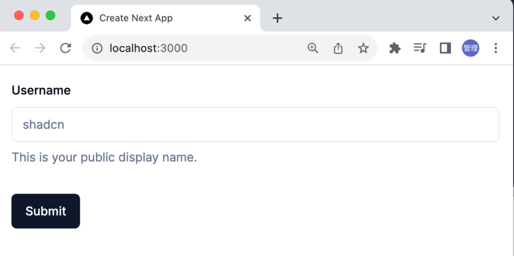
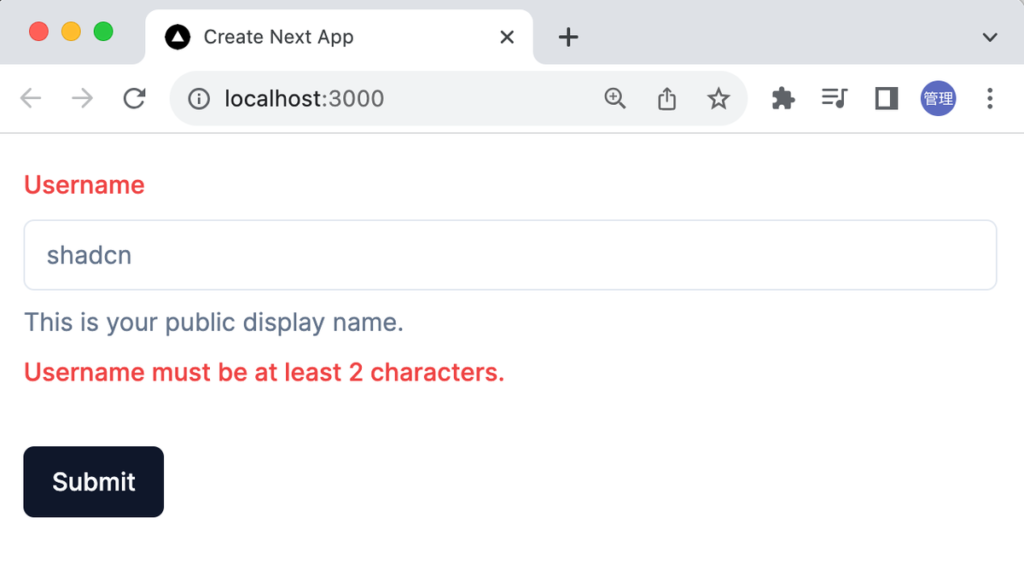
ブラウザで確認するとフォームが表示されます。
input 要素に何も入力せずに”Submit”ボタンをクリックするとバリデーションによりエラーメッセージが表示されます。
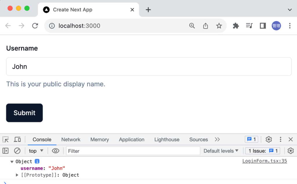
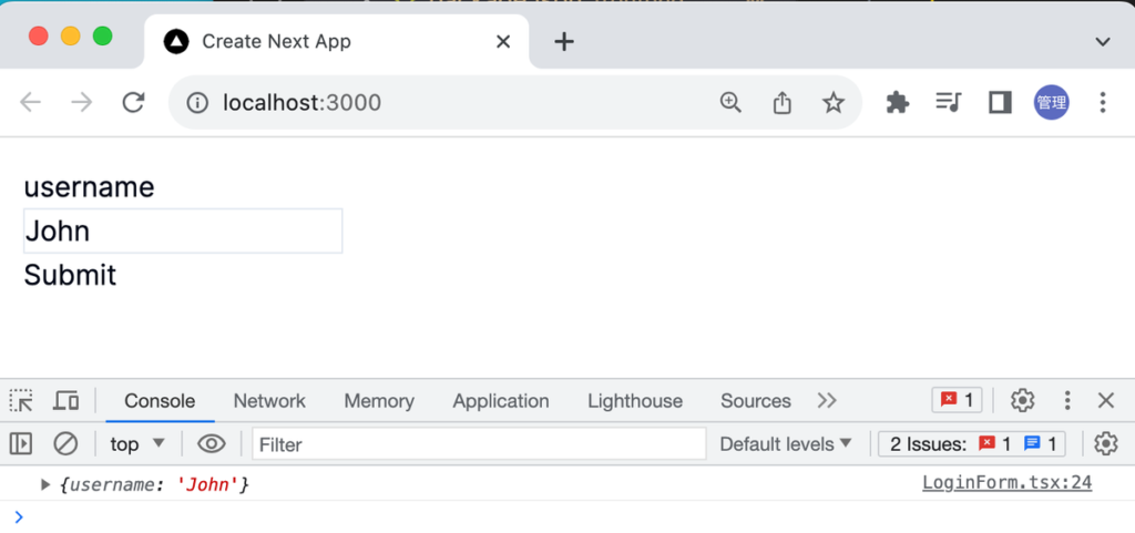
バリデーションにパスした場合は onSubmit 関数が実行されて入力した値がオブジェクトとしてブラウザのコンソールに表示されます。
React Hook Form のみ利用した場合
shadcn/ui を利用することでフォームを作成することができました。shadcn/ui は React Form Hook を利用してフォームを作成しているので React Form Hook を単独で利用した場合にどのようなコードで記述することができるのかを確認しておきます。
'use client';

import {
  useForm,
  Controller,
  FormProvider,
  useFormContext,
} from 'react-hook-form';
import { zodResolver } from '@hookform/resolvers/zod';
import * as z from 'zod';

const formSchema = z.object({
  username: z.string().min(2, {
    message: 'Username must be at least 2 characters.',
  }),
});

const LoginForm = () => {
  const form = useForm<z.infer<typeof formSchema>>({
    resolver: zodResolver(formSchema),
    defaultValues: {
      username: '',
    },
  });

  function onSubmit(values: z.infer<typeof formSchema>) {
    // Do something with the form values.
    // ✅ This will be type-safe and validated.
    console.log(values);
  }
  return (
    <FormProvider {...form}>
      <form onSubmit={form.handleSubmit(onSubmit)}>
        <Controller
          control={form.control}
          name="username"
          render={({ field }) => {
            const { formState, getFieldState } = useFormContext();
            const fieldState = getFieldState(field.name, formState);
            const { error } = fieldState;
            return (
              <>
                <label htmlFor={field.name} className="flex">
                  {field.name}
                </label>
                <input {...field} className="flex border" />
                {error?.message && <div>{error.message}</div>}
              </>
            );
          }}
        />

        <button type="submit">Submit</button>
      </form>
    </FormProvider>
  );
};

export default LoginForm;
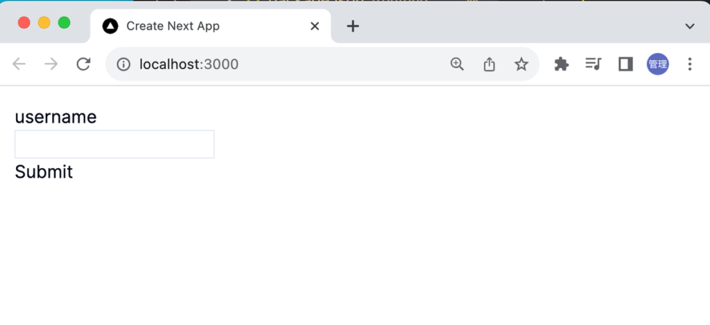
スタイルはほとんど適用していないので下記のようなフォームになります。
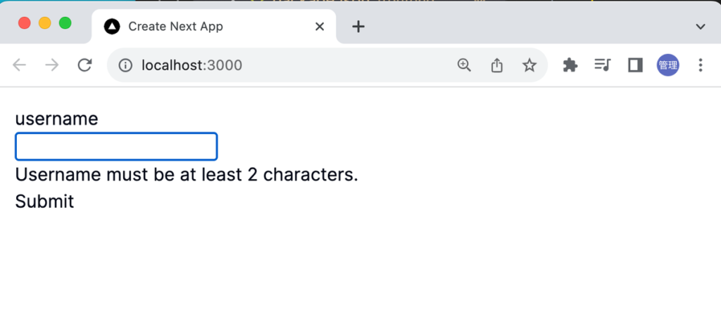
input 要素に何も入力せず”Submit”ボタンを押すとバリデーションのエラーメッセージが表示されます。
2 文字以上に文字を入力して”Submit”ボタンをクリックすると入力した値がオブジェクトで表示されます。
form.tsx ファイルは少し複雑な内容になっていますが React Hook Form のみ利用した場合のコードを見て form.tsx ファイルの各コンポーネントの内容を見るとどのようなことが行われいるかある程度理解できるかと思います。
input の type を number に設定すると”Expected number, received string”のエラーメッセージが表示されます。その場合は zod の coerce を利用することで String を Number に変換してくれます。例)age の場合は z.coerce.number()
ファイルの選択
フォームの中にファイルの選択を行う要素の追加方法について確認します。通常ではファイルを選択する場合には input 要素の type 属性に file を設定します。
page.tsx ファイルを利用して設定を行います。
import { Input } from '@/components/ui/input';
export default function Home() {
return (
<div className="m-4">
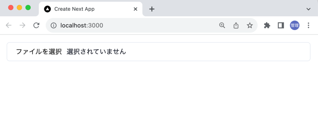
<Input id="picture" type="file" />
</div>
);
}
“ファイルを選択 選択されていません”に囲まれた領域をクリックしてファイルを選択することができます。
type=“file”の設定
React Hook Form を利用した Form でも同様に Input コンポーネントに type=“file”を設定してみましょう。
LoginForm.tsx ファイルをコピーして新たに components ディレクトリに ProfileForm.tsx ファイルを作成します。ProfileForm.tsx ファイルでは username に加えてファイルを保存する picture を追加しています。zod のスキーマでの picture の型には any()を設定しています。
'use client';

import { zodResolver } from '@hookform/resolvers/zod';
import * as z from 'zod';

import { Button } from '@/components/ui/button';
import {
  Form,
  FormControl,
  FormDescription,
  FormField,
  FormItem,
  FormLabel,
  FormMessage,
} from '@/components/ui/form';
import { useForm } from 'react-hook-form';
import { Input } from '@/components/ui/input';

const formSchema = z.object({
  username: z.string().min(2).max(50),
  picture: z.any(),
});

const ProfileForm = () => {
  const form = useForm<z.infer<typeof formSchema>>({
    resolver: zodResolver(formSchema),
    defaultValues: {
      username: '',
    },
  });
  function onSubmit(values: z.infer<typeof formSchema>) {
    // Do something with the form values.
    // ✅ This will be type-safe and validated.
    console.log(values);
  }
  return (
    <Form {...form}>
      <form onSubmit={form.handleSubmit(onSubmit)} className="space-y-8">
        <FormField
          control={form.control}
          name="username"
          render={({ field }) => (
            <FormItem>
              <FormLabel>Username</FormLabel>
              <FormControl>
                <Input placeholder="shadcn" {...field} />
              </FormControl>
              <FormDescription>
                This is your public display name.
              </FormDescription>
              <FormMessage />
            </FormItem>
          )}
        />
        <FormField
          control={form.control}
          name="picture"
          render={({ field }) => (
            <FormItem>
              <FormLabel>Profile Picture</FormLabel>
              <FormControl>
                <Input type="file" {...field} />
              </FormControl>
              <FormDescription>Select Your Profile Picture</FormDescription>
              <FormMessage />
            </FormItem>
          )}
        />
        <Button type="submit">Submit</Button>
      </form>
    </Form>
  );
};

export default ProfileForm;
作成した ProfileForm コンポーネントを page.tsx ファイルで import します。
import ProfileForm from '@/components/ProfileForm';

export default function Home() {
  return (
    <div className="m-4">
      <ProfileForm />
    </div>
  );
}
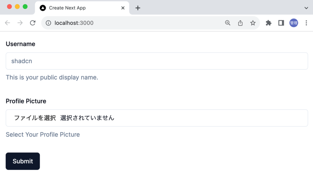
ブラウザで確認すると username の入力項目とファイル選択の項目がブラウザ上に表示されます。
ブラウザ上での表示は問題ありませんがファイルを選択するとブラウザのコンソールには Warning が表示されます。
app-index.js:31 Warning: A component is changing an uncontrolled input to be controlled.
This is likely caused by the value changing from undefined to a defined value, which should not happen.
Decide between using a controlled or uncontrolled input element for the lifetime of the component.
More info: https://reactjs.org/link/controlled-components
    at input
Warning を無視して Submit ボタンをクリックすると下記のように picture の値には’C:\fakepath\profile.png’が表示されます。Input コンポーネントの type 属性に file を設定しただけでは期待した通りの動作にはなりません。
{username: 'John', picture: 'C:\\fakepath\\profile.png'}
Input コンポーネントに type=“file”を設定しただけでは選択したファイルの情報を取り出すことができません。ここからの設定についてはdocs(www): add note on file input with react hook formを参考に行っていきます。
参考したページを元に ProfileForm コンポーネントの書き換えを行います。picture の FormControl の内容を確認してください。
'use client';

import { zodResolver } from '@hookform/resolvers/zod';
import * as z from 'zod';

import { Button } from '@/components/ui/button';
import {
  Form,
  FormControl,
  FormDescription,
  FormField,
  FormItem,
  FormLabel,
  FormMessage,
} from '@/components/ui/form';
import { useForm } from 'react-hook-form';
import { Input } from '@/components/ui/input';

const formSchema = z.object({
  username: z.string().min(2).max(50),
  picture: z.any(),
});

const ProfileForm = () => {
  const form = useForm<z.infer<typeof formSchema>>({
    resolver: zodResolver(formSchema),
    defaultValues: {
      username: '',
    },
  });
  function onSubmit(values: z.infer<typeof formSchema>) {
    // Do something with the form values.
    // ✅ This will be type-safe and validated.
    console.log(values);
  }
  return (
    <Form {...form}>
      <form onSubmit={form.handleSubmit(onSubmit)} className="space-y-8">
        <FormField
          control={form.control}
          name="username"
          render={({ field }) => (
            <FormItem>
              <FormLabel>Username</FormLabel>
              <FormControl>
                <Input placeholder="shadcn" {...field} />
              </FormControl>
              <FormDescription>
                This is your public display name.
              </FormDescription>
              <FormMessage />
            </FormItem>
          )}
        />
        <FormField
          control={form.control}
          name="picture"
          render={({ field: { value, onChange, ...fieldProps } }) => (
            <FormItem>
              <FormLabel>Profile Picture</FormLabel>
              <FormControl>
                <Input
                  type="file"
                  {...fieldProps}
                  accept="image/*"
                  onChange={(event) => {
                    onChange(event.target.files && event.target.files);
                  }}
                />
              </FormControl>
              <FormDescription>Select Your Profile Picture</FormDescription>
              <FormMessage />
            </FormItem>
          )}
        />
        <Button type="submit">Submit</Button>
      </form>
    </Form>
  );
};

export default ProfileForm;
更新後、Warning は消えてファイル選択後に”Submit”ボタンをクリックするとファイルオブジェクトを取得することができるようになります。
picture: FileList {0: File, length: 1}
username: "John"
ファイルの詳細情報を確認するために console.log を使って values.picture の中身を確認します。ファイル名やサイズなどの情報が表示されます。
  function onSubmit(values: z.infer<typeof formSchema>) {
    // Do something with the form values.
    // ✅ This will be type-safe and validated.
    console.log(values.picture);
  }
バリデーションの設定
zod のスキーマでは z.any()を利用していましたが zod でファイルを扱う場合は custom()を利用することができます。custom は zod によってサポートされていない Type のスキーマを作成する際に利用することができます。
const formSchema = z.object({
  username: z.string().min(2).max(50),
  picture: z.custom<FileList>(),
});
formSchema から型を取り出すと picture には FileList が設定されていることが確認できます。
type Schema = z.infer<typeof formSchema>;z.infer を利用した結果、Schema に設定される型は下記となります。
type Schema = {
    username: string;
    picture: FileList;
}
ファイルを選択しない場合にエラーメッセージが表示されるようにバリデーションの設定を行います。ファイルを選択した場合には file には配列でファイルオブジェクトの情報が保存されます。file を選択せず Submit ボタンをクリックすると file の値には undefined が入り、またファイルを選択後にファイル選択をキャンセルすると file の配列の大きさが 0 になるため refine を利用してカスタムバリデーションを下記のように設定しています。
const formSchema = z.object({
username: z.string().min(2).max(50),
picture: z.custom<FileList>().refine((file) => file && file.length !== 0, {
message: 'ファイルが選択されていません',
}),
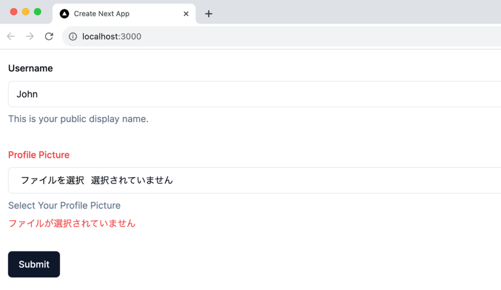
});ファイルを選択せず”Submit”ボタンをクリックするとエラーメッセージが表示されることが確認できます。一度ファイルを選択してキャンセルを行うと同じようにメッセージが表示されます。
ファイルの情報は配列として保存されているので transform()を利用してファイル情報のみ取り出すこともできます。
const formSchema = z.object({
  username: z.string().min(2).max(50),
  picture: z
    .custom<FileList>()
    .refine((file) => file && file.length !== 0, {
      message: 'ファイルが選択されていません',
    })
    .transform((file) => file[0]),
});
shadcn の Form でファイルを扱えるようになりました。
ファイルの送信
サーバに POST リクエストで送信したい場合には formData を利用することができます。送信した formData を Route handlers で受け取れるように app ディレクトリの下に app/profile ディレクトリを作成します。作成後、profile ディレクトリの下に route.ts ファイルを作成します。
受け取った formData を console.log を利用して表示します。
import { NextResponse } from 'next/server';

export async function POST(req: Request, res: Response) {
  const formData = await req.formData();
  console.log(formData);
  return NextResponse.json({ message: 'receive formData' });
}
ProfileForm.tsx ファイルでは formData を利用して fetch 関数を作成した/api/profile に POST リクエストを送信します。
async function onSubmit(values: z.infer<typeof formSchema>) {
  const formData = new FormData();
  formData.append('username', values.username);
  formData.append('picture', values.picture);

  await fetch('/api/profile', {
    method: 'post',
    body: formData,
  });
}
“npm run dev”コマンドを実行したターミナルには受信した formData の情報が表示されます。
FormData {
  [Symbol(state)]: [
    { name: 'username', value: 'John' },
    { name: 'picture', value: [File] }
  ]
}
ファイルの送信、受信ができることが確認できました。
Table の利用方法
shadcn で shadcn の Table コンポーネントのみを利用した設定と TanStack の React Table を利用した方法があります。本文書では 2 つの方法でテーブルの作成方法を確認します。

どちらの方法でも Table コンポーネントを利用するのインストールを行います。
% npx shadcn-ui@latest add table
インストールが完了すると components/ui ディレクトリに table.tsx ファイルが作成されます。
基本の Table コンポーネント
テーブルを作成するためにはテーブルを構成するデータが必要となります。データは無料で利用できる JSONPlaceHolder を利用します。https://jsonplaceholder.typicode.com/postsにアクセスすると100件のPostデータを取得することができます。
components ディレクトリに BasicTable.tsx ファイルを作成して以下のコードを記述します。table タグを Table タグ、thead タグを TableHeader タグのように通常の Table を構成するタグを Table コンポーネントから import したコンポーネントタグに変更します。
import {
  Table,
  TableBody,
  TableCaption,
  TableCell,
  TableHead,
  TableHeader,
  TableRow,
} from '@/components/ui/table';

type Post = {
  userId: number;
  id: number;
  title: string;
  body: string;
};

const BasicTable = async () => {
  const response = await fetch('https://jsonplaceholder.typicode.com/posts');
  const posts: Post[] = await response.json();

  return (
    <div>
      <Table>
        <TableCaption>A list of posts</TableCaption>
        <TableHeader>
          <TableRow>
            <TableHead>userId</TableHead>
            <TableHead>Id</TableHead>
            <TableHead>Title</TableHead>
            <TableHead>Body</TableHead>
          </TableRow>
        </TableHeader>
        <TableBody>
          {posts.map((post) => (
            <TableRow key={post.id}>
              <TableCell>{post.userId}</TableCell>
              <TableCell>{post.id}</TableCell>
              <TableCell>{post.title}</TableCell>
              <TableCell>{post.body}</TableCell>
            </TableRow>
          ))}
        </TableBody>
      </Table>
    </div>
  );
};

export default BasicTable;
作成した BasicTable.tsx ファイルを page.tsx ファイルで import します。
import BasicTable from '@/components/BasicTable';
export default function Home() {
return (
<div className="m-4">
<BasicTable />
</div>
);
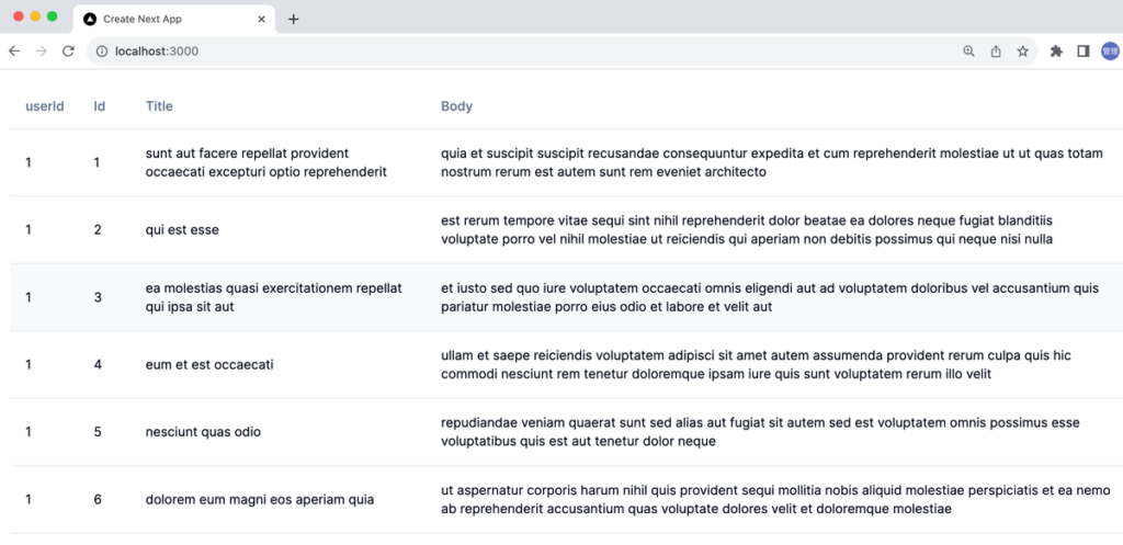
}ブラウザから確認するとシンプルなデザインのテーブルが表示されます。
Tanstack Table を利用した場合
Tanstack Table を利用する場合は Tanstack Table のインストールが必要となります。
% npm install @tanstack/react-table
TanStack Table は Client Component でしか利用することができないので Server Component として設定すると以下のエラーメッセージが表示されます。
Error: useState only works in Client Components. Add the "use client" directive at the top of the file to use it. Read more: https://nextjs.org/docs/messages/react-client-hook-in-server-componentcomponents ディレクトリに TanStackTable.tsx ファイルを作成して shadcn の Table コンポーネントを利用せず TanStack Table のみ利用したコードを記述します。
'use client';
import {
flexRender,
getCoreRowModel,
useReactTable,
} from '@tanstack/react-table';
import { useEffect, useState } from 'react';
type Post = {
userId: number;
id: number;
title: string;
body: string;
};
const TanStackTable = () => {
const [posts, setPosts] = useState<Post[]>([]);
useEffect(() => {
const getPosts = async () => {
const response = await fetch(
'https://jsonplaceholder.typicode.com/posts'
);
const data = await response.json();
setPosts(data);
};
getPosts();
}, []);
const columns = [
{
accessorKey: 'userId',
},
{
accessorKey: 'id',
},
{
accessorKey: 'title',
},
{
accessorKey: 'body',
},
];
const table = useReactTable({
data: posts,
columns,
getCoreRowModel: getCoreRowModel(),
});
return (
<table>
<thead>
{table.getHeaderGroups().map((headerGroup) => (
<tr key={headerGroup.id}>
{headerGroup.headers.map((header) => (
<th key={header.id}>
{flexRender(
header.column.columnDef.header,
header.getContext()
)}
</th>
))}
</tr>
))}
</thead>
<tbody>
{table.getRowModel().rows.map((row) => (
<tr key={row.id}>
{row.getVisibleCells().map((cell) => (
<td key={cell.id}>
{flexRender(cell.column.columnDef.cell, cell.getContext())}
</td>
))}
</tr>
))}
</tbody>
</table>
);
};
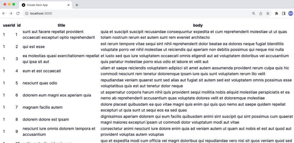
export default TanStackTable;ブラウザから確認するとスタイルの適用されていないテーブルが表示されます。
TanStack Table のみではスタイルは適用されてないので shadcn の Table コンポーネントを利用してスタイルを適用します。
'use client';

import {
  flexRender,
  getCoreRowModel,
  useReactTable,
} from '@tanstack/react-table';
import {
  Table,
  TableBody,
  TableCell,
  TableHead,
  TableHeader,
  TableRow,
} from '@/components/ui/table';
import { useEffect, useState } from 'react';

type Post = {
  userId: number;
  id: number;
  title: string;
  body: string;
};

const TanStackTable = () => {
  const [posts, setPosts] = useState<Post[]>([]);

  useEffect(() => {
    const getPosts = async () => {
      const response = await fetch(
        'https://jsonplaceholder.typicode.com/posts'
      );
      const data = await response.json();
      setPosts(data);
    };

    getPosts();
  }, []);

  const columns = [
    {
      accessorKey: 'userId',
    },
    {
      accessorKey: 'id',
    },
    {
      accessorKey: 'title',
    },
    {
      accessorKey: 'body',
    },
  ];

  const table = useReactTable({
    data: posts,
    columns,
    getCoreRowModel: getCoreRowModel(),
  });

  return (
    <Table>
      <TableHeader>
        {table.getHeaderGroups().map((headerGroup) => (
          <TableRow key={headerGroup.id}>
            {headerGroup.headers.map((header) => (
              <TableHead key={header.id}>
                {flexRender(
                  header.column.columnDef.header,
                  header.getContext()
                )}
              </TableHead>
            ))}
          </TableRow>
        ))}
      </TableHeader>
      <TableBody>
        {table.getRowModel().rows.map((row) => (
          <TableRow key={row.id}>
            {row.getVisibleCells().map((cell) => (
              <TableCell key={cell.id}>
                {flexRender(cell.column.columnDef.cell, cell.getContext())}
              </TableCell>
            ))}
          </TableRow>
        ))}
      </TableBody>
    </Table>
  );
};

export default TanStackTable;
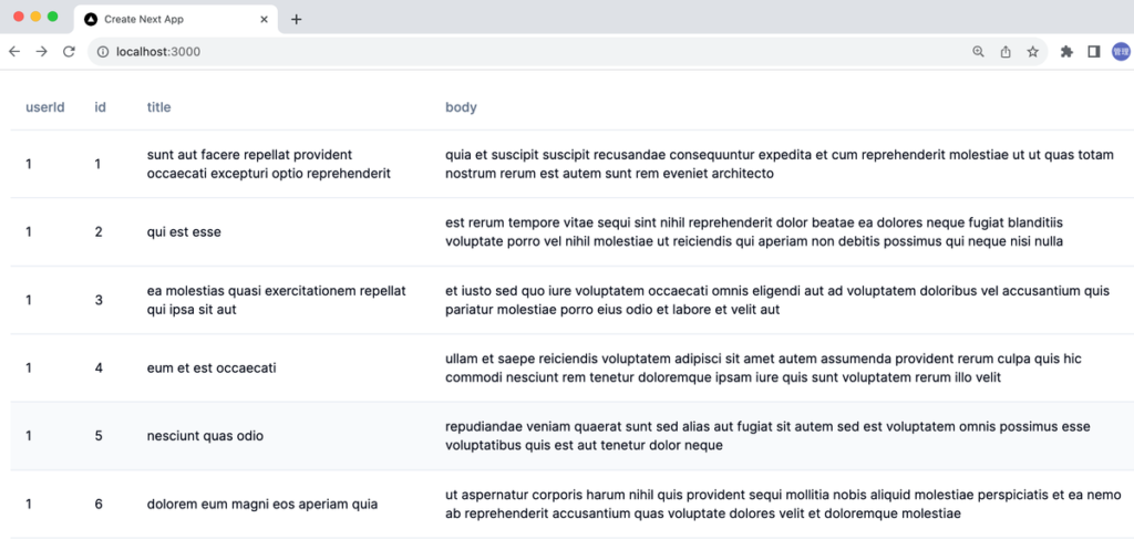
shadcn によるスタイルが適用されたテーブルが表示されます。
Sorting 機能の追加
TanStack Table を利用しましたがここまでの設定では TanStack Table を利用するメリットは何もありません。TanStack Table を利用することで Pagination, Sorting などの機能を簡単に実装することができます。
列名をクリックすると Sorting(並び替え)ができるように機能の追加を行います。Sorting を機能するために getSortedRowModel を新たに’@tanstack/react-table’から import します。import した getSortedRowModel を useReactTable 関数の引数のオブジェクトに追加します。
'use client';

import {
  flexRender,
  getCoreRowModel,
  useReactTable,
  getSortedRowModel,
} from '@tanstack/react-table';
import {
  Table,
  TableBody,
  TableCell,
  TableHead,
  TableHeader,
  TableRow,
} from '@/components/ui/table';
import { useEffect, useState } from 'react';

type Post = {
  userId: number;
  id: number;
  title: string;
  body: string;
};

const TanStackTable = () => {
  const [posts, setPosts] = useState<Post[]>([]);

  useEffect(() => {
    const getPosts = async () => {
      const response = await fetch(
        'https://jsonplaceholder.typicode.com/posts'
      );
      const data = await response.json();
      setPosts(data);
    };

    getPosts();
  }, []);

  const columns = [
    {
      accessorKey: 'userId',
    },
    {
      accessorKey: 'id',
    },
    {
      accessorKey: 'title',
    },
    {
      accessorKey: 'body',
    },
  ];

  const table = useReactTable({
    data: posts,
    columns,
    getCoreRowModel: getCoreRowModel(),
    getSortedRowModel: getSortedRowModel(),
  });

  return (
    <Table>
      <TableHeader>
        {table.getHeaderGroups().map((headerGroup) => (
          <TableRow key={headerGroup.id}>
            {headerGroup.headers.map((header) => (
              <TableHead
                key={header.id}
                // onClick={header.column.getToggleSortingHandler()}
              >
                {flexRender(
                  header.column.columnDef.header,
                  header.getContext()
                )}
              </TableHead>
            ))}
          </TableRow>
        ))}
      </TableHeader>
      <TableBody>
        {table.getRowModel().rows.map((row) => (
          <TableRow key={row.id}>
            {row.getVisibleCells().map((cell) => (
              <TableCell key={cell.id}>
                {flexRender(cell.column.columnDef.cell, cell.getContext())}
              </TableCell>
            ))}
          </TableRow>
        ))}
      </TableBody>
    </Table>
  );
};

export default TanStackTable;
次に TableHead に onClick イベントを設定します。
<TableHead
key={header.id}
onClick={header.column.getToggleSortingHandler()}
>
{flexRender(
header.column.columnDef.header,
header.getContext()
)}
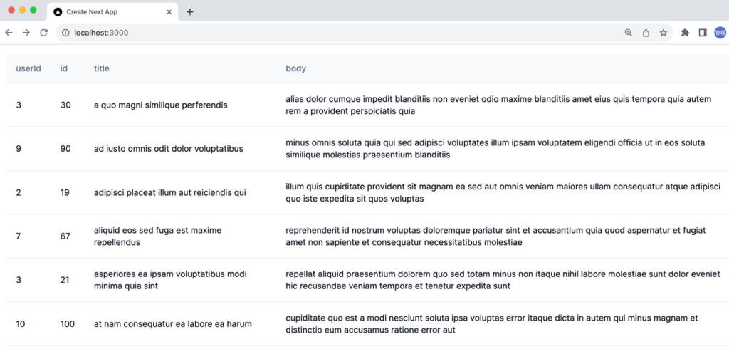
</TableHead>title 列をクリックした場合はアルファベット上に Sorting されていることが確認できます。すべての列で Sorting を行うことができます。
TanStack Table の Sorting 機能を含めた Table コンポーネントの基本的な利用方法も理解することができました。
Blocks
新たに2024年3月にBlocksという機能が追加されました。事前に公開されているBlocksのコードをコピー&ペーストとしてBlocksのコードを構成するshadcn/uiのコンポーネントをインストールするだけで簡単にダッシュボードのページを作成することができます。
下記のページがBlocksで作成さえたページです。このページをそのまま利用したい場合には”Edit in v0″の左側にあるコピーボタンをクリックします。
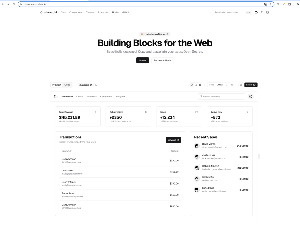
page.tsxファイルにそのままコピーします。コードを見るとavatar, badge, button, card, dropdown-menu, input, sheetコンポーネントを利用しているのでそれらのコンポーネントをすべてインストールします。
 % npx shadcn-ui@latest add avatar
✔ Done.
 % npx shadcn-ui@latest add badge
✔ Done.
 % npx shadcn-ui@latest add button
✔ Done.
 % npx shadcn-ui@latest add card
✔ Done.
 % npx shadcn-ui@latest add dropdown-menu
✔ Done.
 % npx shadcn-ui@latest add input
✔ Done.
 % npx shadcn-ui@latest add sheet
✔ Done.
 % npx shadcn-ui@latest add table
✔ Done.
インストールを行なって開発サーバを起動するとダッシュボードが表示されます。レスポンシブにも対応しているのでブラウザの幅を変更するとスマホ用のデザインに変わります。
Blocksのページには”Request a block”というボタンも用意されており、今後もBlocksは増えていくことが予想されるので今まで以上に簡単にshadcn/uiを利用してページを作成することができます。